Some elements on this page may not function normally with JavaScript disabled. Please enable JavaScript for the best experience.
Case Study:
Word of Hands
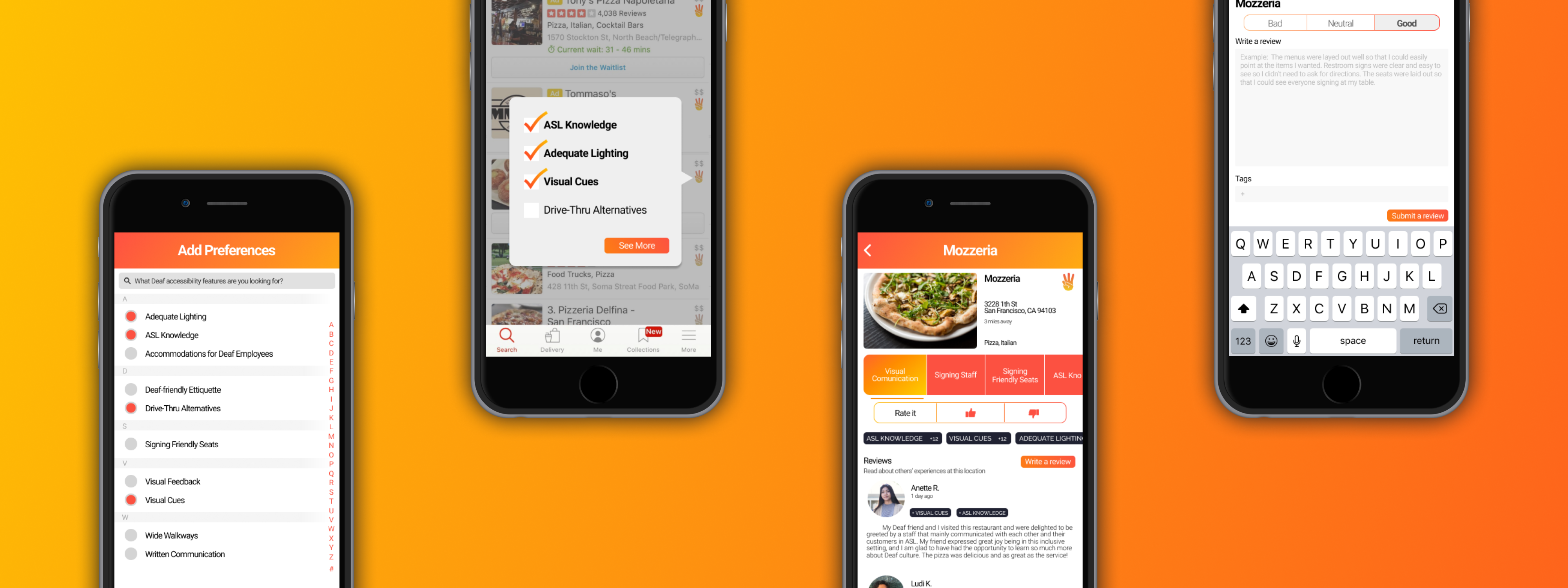
Description
Word of Hands is a mobile add-on to popular reviewing platforms like Yelp. Its main purpose is to provide a space for people with Deaf accessibility needs to easily write and find reviews for different businesses, allowing the Deaf community and those involved to browse this information more easily and and use it to make more informed decisions.
Roles
Since this was an interdisciplinary, large team effort, all of us wore many hats.
I performed the role of a User Researcher and personally conducted 4 interviews with a Deaf professor, interpreter, researcher, and Deaf student to gain an inside perspective on the issues that each interviewee uniquely faces in their lives.
I also took the role of a UX/Visual Designer in collaboratively designing the experience, interface, and logo of our product.
Collaborators
Ana Dasgupta
Josh Duhay
Miriam Wagner
Sanika Moharana
Steven Phung
Tommy Sharkey
Vidya Raghvendra
Methodology
Moodboards
User Interviews
Diverge-and-Converge
Prioritization Grid
Competitive Analysis
User Flow Mapping
Lo-/Hi-Fi Prototyping
Research
Our project began with a broad task: Design a solution that addresses the social issue of Deaf accessibility.
Naturally, as a team, we were lost and overwhelmed by all the possible directions in which we could take our project. In order to narrow down our scope into more specific and concrete area, we decided to do some independent research on areas of accessibility that interested us. One of these areas was Deaf accessibility, and after looking through our findings thoroughly, we discovered that the issues surrounding Deaf accessibility were not only the most challenging, but also the least addressed.
From here, our goal started to take form, coming from the desire to alleviate some of these alarming discoveries. After our initial stage of research, we delved deeper by conducting over 15 interviews with people involved with the Deaf community, including Deaf students themselves, Deaf researchers, interpreters, Deaf educators, and members from Gallaudet University, a private university for educating the Deaf and hard of hearing.
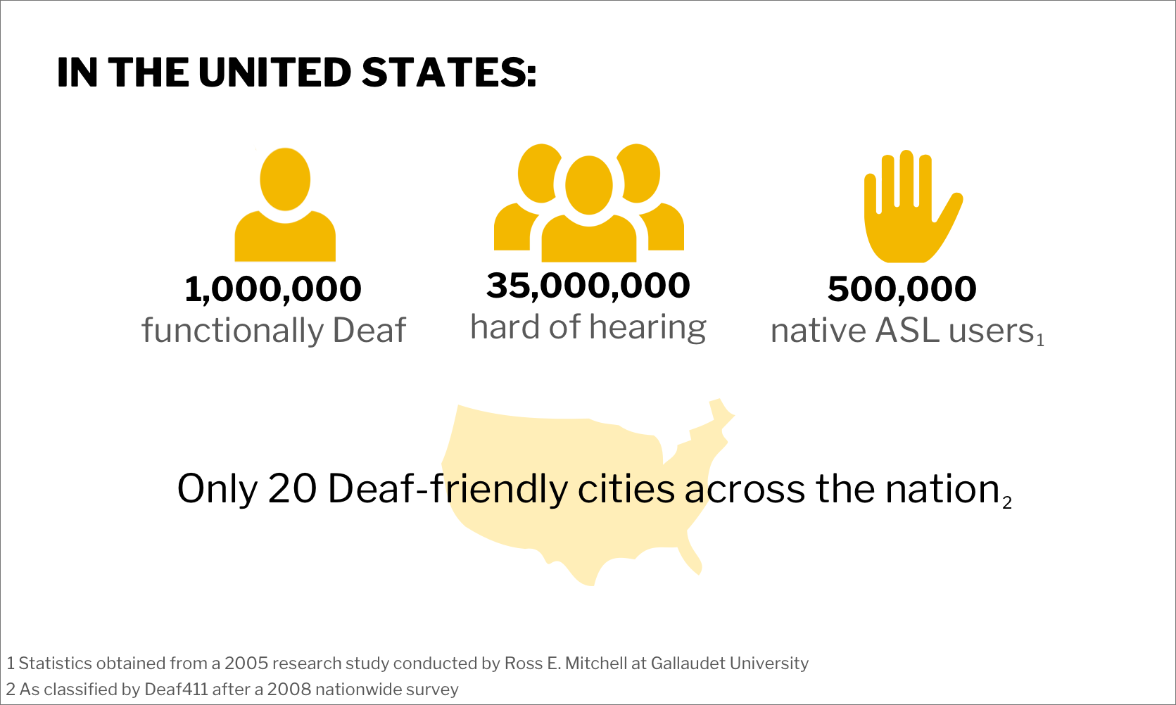
An infographic summing up our most prominent findings.
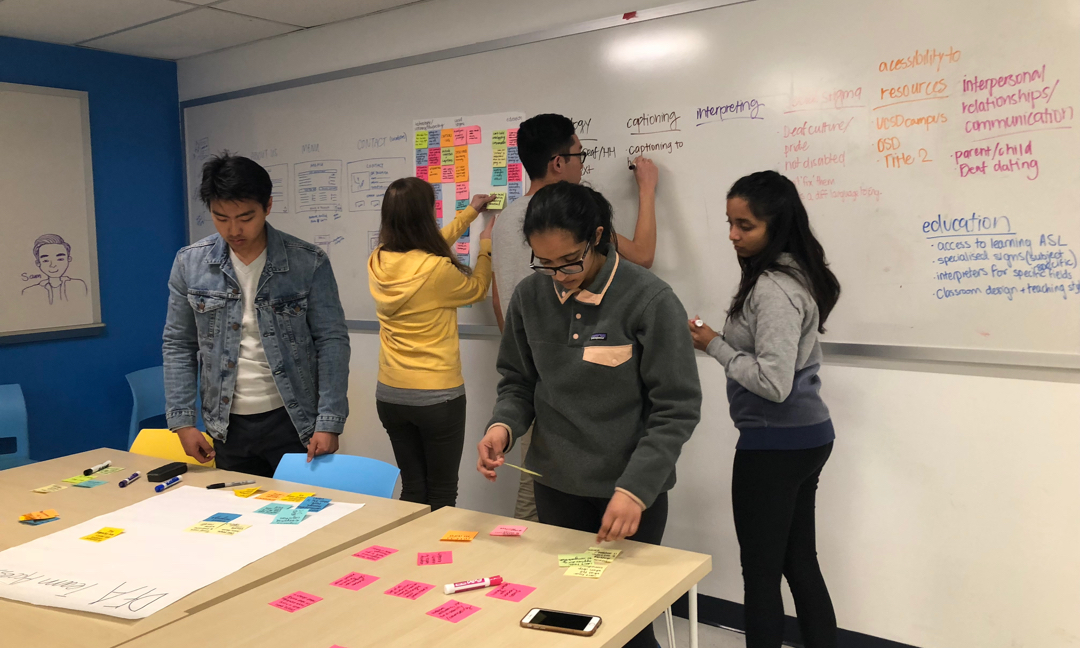
After our interviews, we categorized our insights to draw conclusions and identify potential areas of focus.
Pain Points
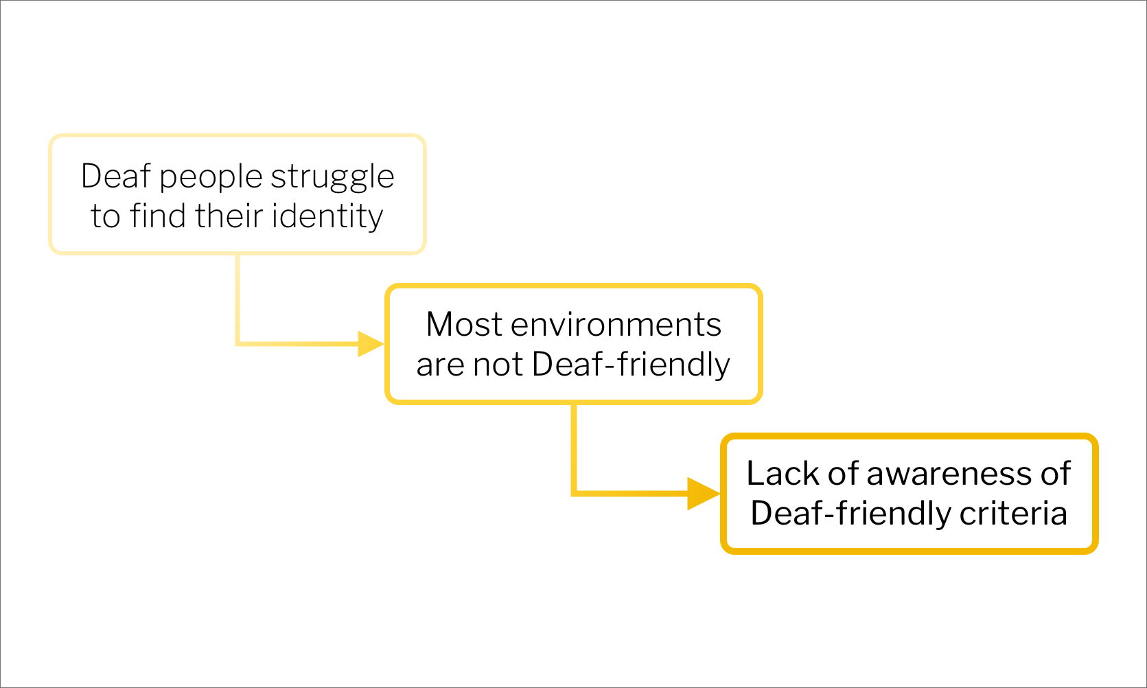
Our cascade of pain points that incrementally increase in feasibility.
After consolidating the insights we gained through our research, we were able to draw some solid conclusions about our user’s pain points and began brainstorming potential ways to address them with our solution. In the end, we narrowed down our focus onto a specific cascade of pain points. Our purpose for constructing our pain points this way was to reach a single, core need that we could tangibly and feasibly address, while still ensuring that we were on the right track by designing a solution for something that is relevant within the Deaf community. Our final pain point ended up being the lack of social awareness of what it means to be Deaf-friendly.
With the completion of all of our interviews and our pain points fully fleshed out, we finally felt that we had a solid grasp on the needs of the Deaf community. To guide our design process, we constructed a clear design goal:
Design a solution that promotes awareness about what it means to be Deaf-friendly and helps people easily find information about Deaf-friendly spaces.
Platform
To begin our design process, we needed to first figure out what kind of platform or medium we would be utilizing. We considered several possibilities, including non-digital solutions like designing a physical study space at UCSD that adheres to Deaf-friendly guidelines and supports inclusivity. However, we met some roadblocks as we'd need to coordinate with the school itself to get an area to work with, as well as come up with a large budget.
Ultimately, we decided to design a digital solution. In choosing this platform, we found several interview insights extremely useful as justification. One, particularly useful, came from the Deaf ally on our design team, who was also the UCSD ASL Club President.
“ Deaf people are more tech-savvy. They use technology to solve their problems because it plays to their strengths. ”
— Tommy Sharkey, ASL Club President
Competitive Analysis
With our sights set on a digital solution as the best platform both for us as a team to work on and for people from the Deaf community to use, we began brainstorming the different routes we could take. Among these was the idea to facilitate reviewing businesses for “Deaf-friendly”-ness. Our team decided to explore this option further by doing a competitive analysis of existing platforms that purport to fill this space. You can see a short overview of our findings here.
One of the most modern solutions out there. However, it targets a large range of accessibility needs, including other physical disabilities, and also contains only a limited number of businesses in its database.
Targeted specifically towards Deaf accessibility features. However, like AccessNow, it only contains a limited number of businesses in its database, and it seems to be underused and inactive.
AbleRoad
A website that provided a wealth of specific accessibility information for users to browse and add on to themselves. However, the website has actually shut down since we analyzed it and when it was up, it definitely showed its age with outdated designs and an inefficient user flow.
In summary, we found that all of these platforms suffered from the same issue: they became obsolete and outdated due to inactivity. Few people knew about them; without an active userbase, they couldn’t be sustained. We saw this as an important issue to address when designing our own solution, and this is largely what led us to develop an add-on rather than a standalone app. By connecting our solution with something that is already popular, like Yelp, we'd have a higher chance of maintaining an active and self-sustaining userbase.
Another issue that we identified was the ambiguity behind "Deaf accessibility." This blanket term can be vague and unhelpful, especially if you haven’t had many interactions with the Deaf community. As a team, we made it our goal to clarify this ambiguity by deciding on specific criteria for evaluating Deaf-friendliness, at least within Word of Hands. By doing this, we hoped to not only provide a strong basis for our system, but also guide businesses with specific steps for becoming more Deaf-friendly.
User Flow Mapping
Having established our platform and completed our competitive audit, we definitely wanted to focus back in on our own product. To do this, we mapped out a general user flow—the golden path—to contextualize the ideal scenario that a user of our application might experience.
In the user flow, we wanted to highlight that Word of Hands is meant to be easy to learn and easy to use. Additionally, mapping the flow together helped us align internally, between the team members, on the target audience we wanted to reach and how our application would ultimately improve the experience of looking for a business to visit.
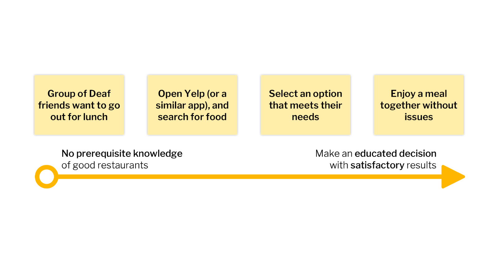
The final user flow. Our application should make the entire process quick and satisfactory.
Design Iterations
The next step of our design process was simply to sketch out the screens that would be necessary to fulfill the user flow that we had outlined. Our first iteration was sketched on a whiteboard, in extremely low fidelity to simply establish the concept of Word of Hands’ experience. After bringing our designs to Tommy, our Deaf ally, we incorporated his feedback and criticisms into a second round of iterations. This time, we went more in-depth with the details and discussed topics like microinteractions and technicalities, documenting everything on the whiteboard through sketches and notes.
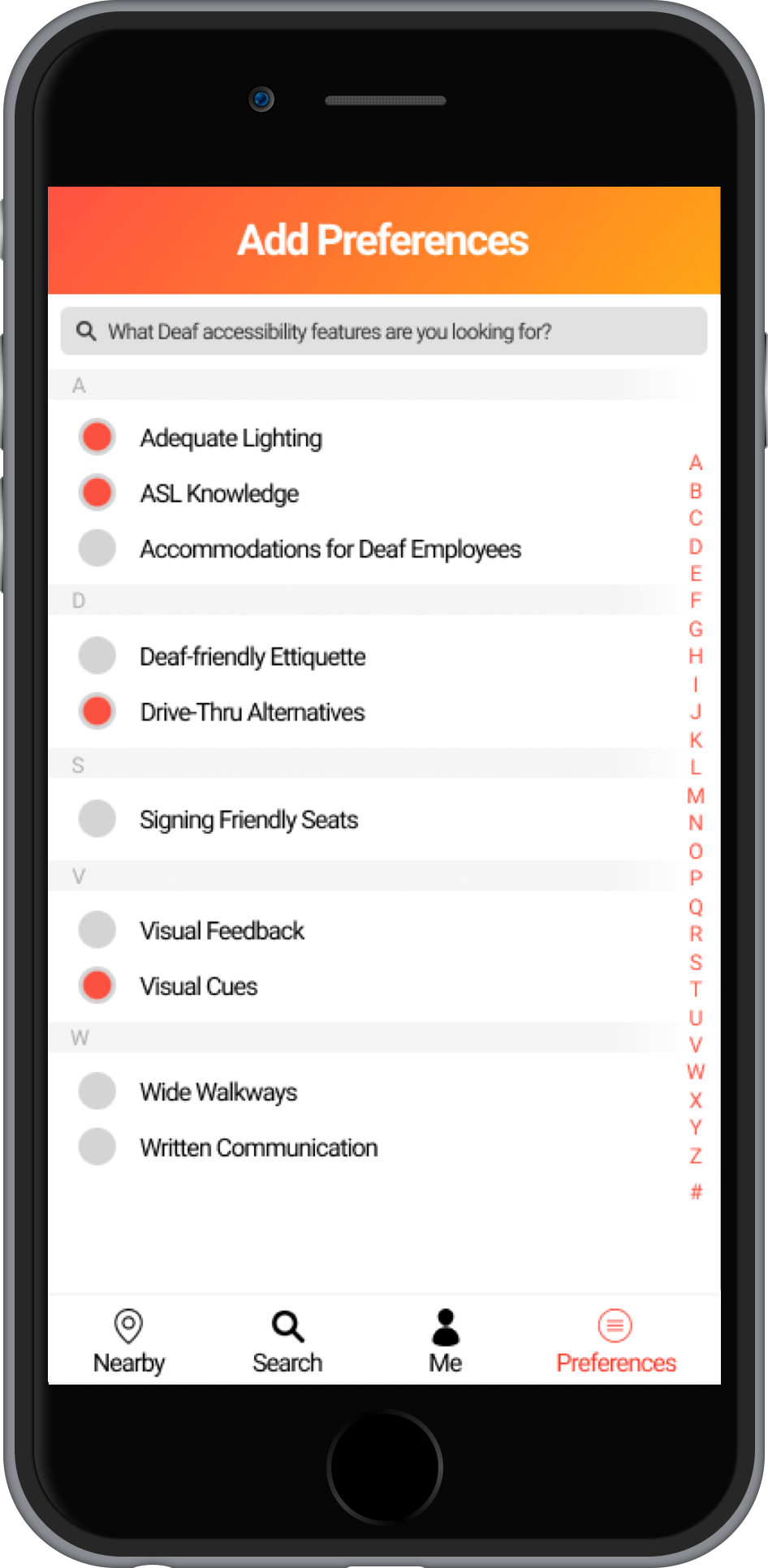
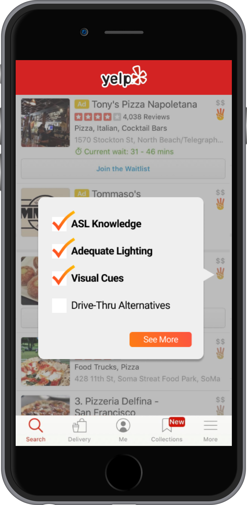
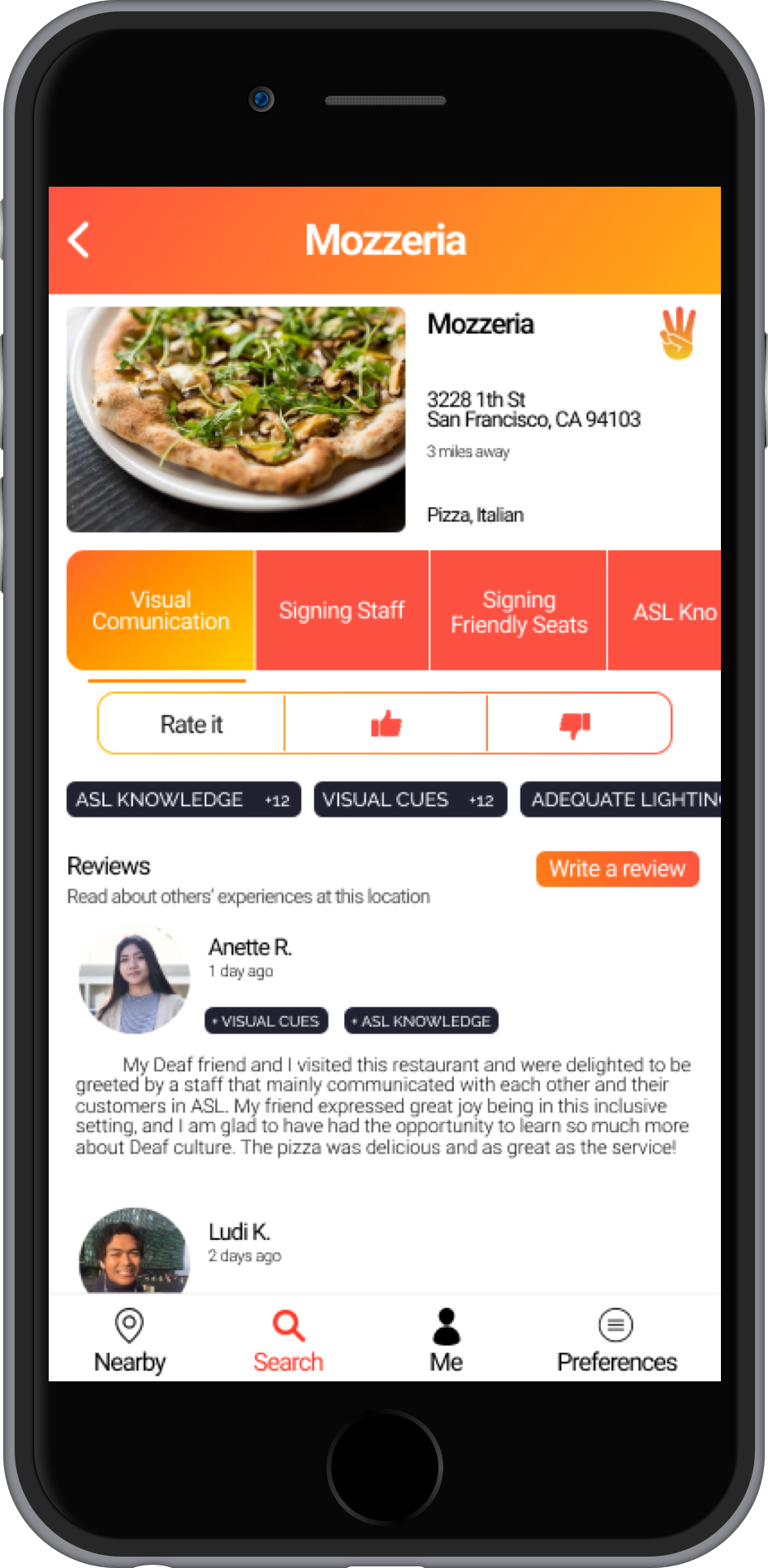
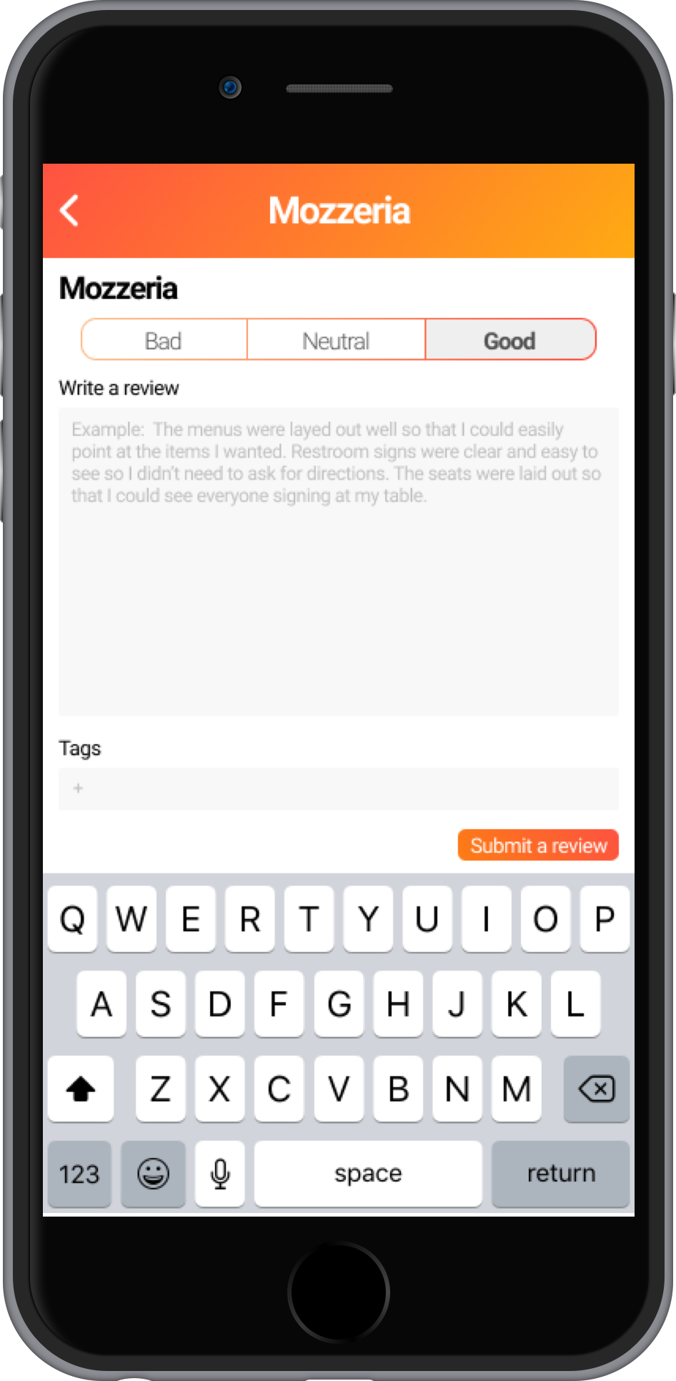
With our concepts finalized in low-fidelity, we took to the computer to flesh out the actual screens in Sketch. Throughout this whole process, we constantly validated our ideas with Tommy to ensure that we were staying on track. In total, we implemented 3 iterations of design, the third being the final screens displayed above.
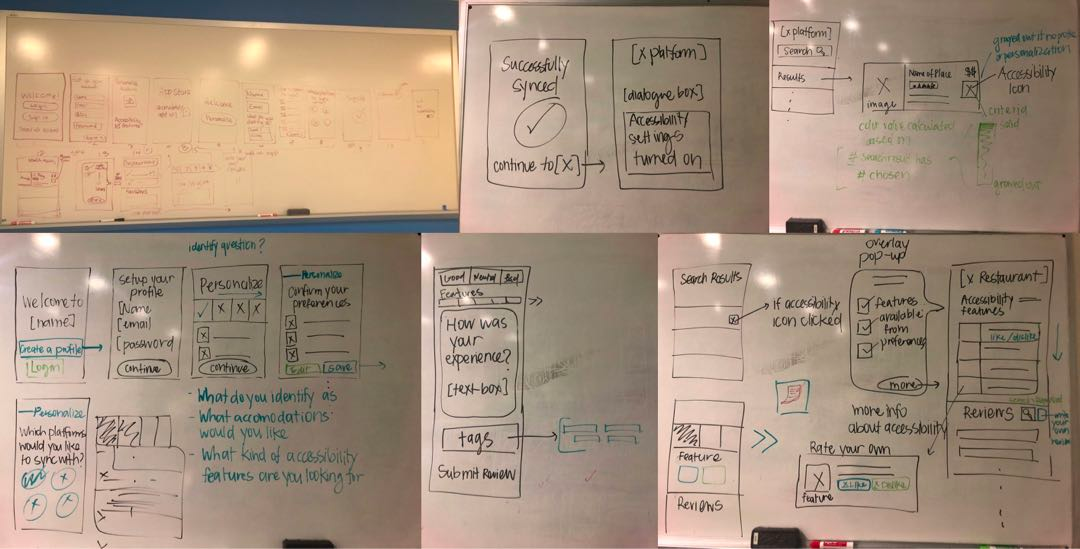
Our first iteration is shown on the top left, while all the other screens are from our second iteration.
Design a solution that promotes awareness about what it means to be Deaf-friendly and helps people easily find information about Deaf-friendly spaces.
Result
Looking back at our original design goal, we touched on all of the main needs that we set out to address. We effectively helped promote awareness about Deaf accessibility by creating a platform for people to view and rate Deaf accessibility features. Furthermore, by linking this platform to an existing platform that is already popular, it would be more streamlined and be able to reach people even outside of our target audience. This way, people who were originally unfamiliar with Deaf accessibility could now easily learn about it. Not only would our application benefit users, helping them easily find information about Deaf accessibility and become more aware in general, but it would also incentivize businesses to adopt Deaf-friendly practices. Our solution was multifaceted and effectively addressed our design goal and our users’ core pain points.
Retrospective & Next Steps
Continue Iterating: Although we were able to iterate our design 3 times, retrospect makes me wish that we had spent slightly less time conducting interviews and more time on developing clear interactions within our prototype. While research and immersion is good, I feel that we could have started concepting much earlier in the project term. This way, we would have time to create interactions and conduct usability testing.
Develop Interactions & User Test: Along the same line, our next steps would definitely include developing the interactions of our product and bring these interactions into user testing sessions. The best way to refine our design even further would be to validate it with actual users from the Deaf community.
Our product brand.
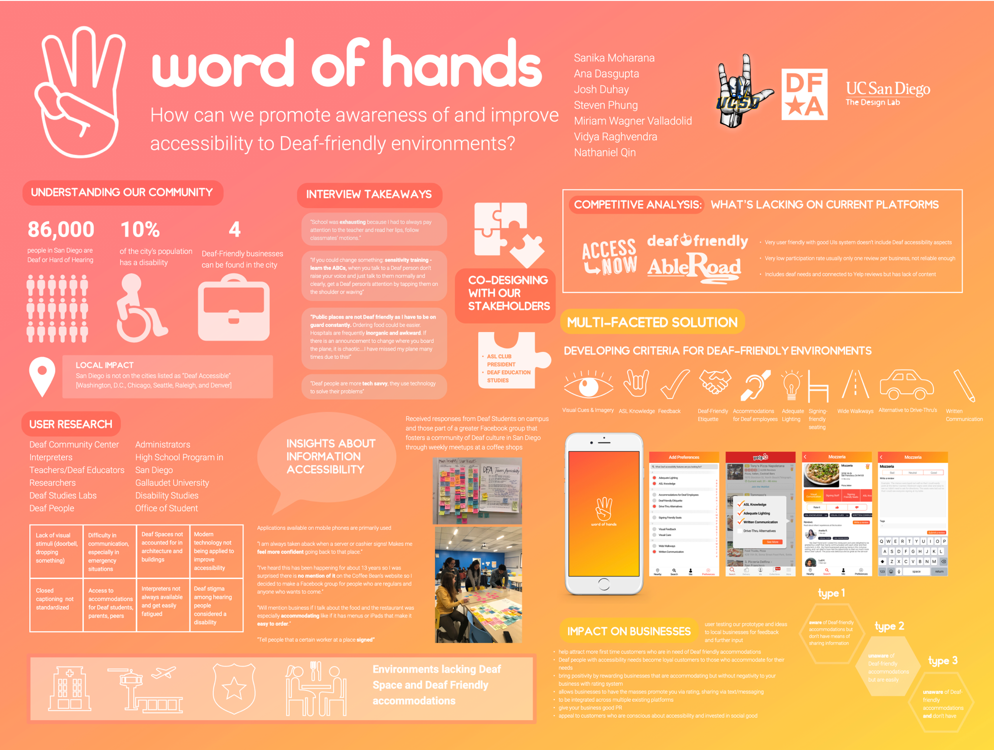
A final poster we put together for our end-of-year summary showcase.


